CSS揭秘
1. 引言
能猜想到收货不大,但是因为强迫症而读完了
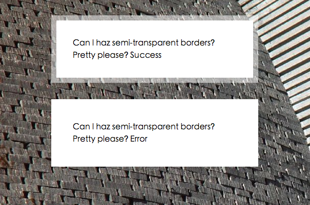
2. 背景与边框
2.1 半透明边框
http://demo.404mzk.com/cssjiemi/01-translucent-borders.html
body{
    background: url('./images/stone-art.jpg')
}
div{
    border: 10px solid hsla(0, 0%, 100%, .5);;
    background: white;


    max-width: 20em;
    padding: 2em;
    margin: 2em auto 0;
    font: 100%/1.5 sans-serif;
}
.success{
    background-clip: padding-box;
}

.error{
    /* 默认border-box  所以背景background 的白在底部 看不出透明的感觉 */
    /*background-clip: padding-box;*/
}
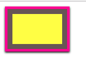
2.2 多重边框
http://demo.404mzk.com/cssjiemi/02-multiple-borders.html
.box-shadow{
    width: 100px;
    height: 60px;
    margin: 25px;
    background: yellow;
            /* offset-x offset-y blur-radius spread-radius color*/
    box-shadow: 0 0 0 10px #655,
                0 0 0 15px deeppink,
                0 2px 5px 15px rgba(0,0,0.6);
}
需要注意的是
- box-shadow是一层层的 像#655 在最里扩张半径为10 而deeplink设为15 其实只有5px的扩张半径
- box-shadow属于外圈 即不在点击范围内 设置内嵌 需要在属性前加inset
2.3 灵活的背景定位
http://demo.404mzk.com/cssjiemi/03-background.html
实现右下角设置图标的功能
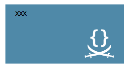
.text-box{
    width: 200px ;
    height: 100px;
    padding: 10px 20px;
    margin: 10px;
}
.background-position{
    background: url('./images/code-pirate.svg') no-repeat #58a bottom right;
    background-position: right 20px bottom 10px;
}
.background-origin{
    background: url('./images/code-pirate.svg') no-repeat #58a bottom right;
    background-origin: content-box;
    background-position: right bottom;
}
.background-cale{
    background: url('./images/code-pirate.svg') no-repeat #58a bottom right;
    background-position:  calc(100% - 20px)  calc(100% - 10px);
}
- 最后的
bottom right是为了防止不支持background-position设置数值的浏览器 能退化到图标在右下角
2.4 边框内圆角
http://demo.404mzk.com/cssjiemi/04-inner-rounding.html
.scheme1{
    outline: .6em solid #655;
    box-shadow: 0 0 0 .4em #655;

    max-width: 10em;
    border-radius: .8em;
    padding: 1em;
    margin: 1em;
    background: tan;
    font: 100%/1.5 sans-serif;
}

.scheme2{
    background: #655;
    padding: .6em;
    max-width: 12em;

}
.scheme2 > div {

    background: tan;
    border-radius: .8em;
     padding: 1em;
     font: 100%/1.5 sans-serif;

}
<div class="scheme1">I have a nice subtle inner rounding, don’t I look pretty?</div>

<div class="scheme2">
    <div>
        I have a nice subtle inner rounding, don’t I look pretty?
    </div>
</div>
用了两种方式实现边框内圆角
第一种方式用
outline画外部的灰色边框
然后内部用圆角
但是会有一些间隙
用box-shadow填补
那么box-shadow应该设置多少了
现在我们的border-radio设置的是.8em 表明 是个正圆
所以边长一致, 圆心到描边角的距离为 开根号(0.8^2 + 0.8^2) 所以box-shadow 应该是 开根号(2 * (0.8^2) ) - 0.8
总结公式可为 r(根号2 - 1) 因为根号2-1 < 0.5 也可以偷懒设置为0.5 所以就是0.5 * r (r即为border-radius)
该公式也暴露了一个问题 box-shadow需要比outline宽度小, 并且 扩张半径要比(根号2 -1)r要大 才能进行填充
第二种方式就比较简单了不多说明了
2.5 条纹背景
如果多个色标具有相同的位置, 他们会产生一个无限小的过渡区域,

过渡的起止色分别是 第一个和最右一个指定值, 从效果上看 颜色会在那个位置突然变化

而不是一个平滑的剪标过程
如果某个色标的位置值比整个列表中在它之前的色标位置值都要小

则该色标的位置值会被设置为它前面所有色标位置值的最大值
5. 字体排印
7. 结构和布局
7.38 根据兄弟元素的数量来设置样式
想当列表中子元素的个数为4个的时候设置元素
li:first-child:nth-last-child(4),  /* 匹配第一个元素 并且是倒数第4个元素 那就是li元素只有4个情况才能匹配上*/
li:first-child:nth-last-child(4) ~ li  /* 取到第一个元素然后向后取兄弟节点*/
{  }
做成通用的scss就是
@mixin n-items($n){
    &:first-child:nth-last-child(#{$n}),
    &:first-child:nth-last-child(#{$n} ~ &) {
        @content;
    }
}

/* 调用时 */
li {
    @include n-items(4){
        xxx
    }
}
当想匹配到元素大于等于4个时 样式为A
li:first-child:nth-last-child(n+4),
li:first-child:nth-last-child(n+4) ~ li { A }
当想匹配元素小于等于4个时样式为B
li:first-child:nth-last-child(-n+4),
li:first-child:nth-last-child(-n+4) ~ li { B }